Lympid
Lympid
Project type: Branding+Website
Project type: Visual Design + Branding
Year: 2022
Year: 2022
Lympid, is a project dedicated to blockchain and decentralized finance. The brand focus on transactions between EURO to crypto and back.
We developed the branding, look and feel, and website.
Lympid, is a project dedicated to blockchain and decentralized finance. The brand focus on transactions between EURO to crypto and back.
We developed the branding, look and feel, and website.
Lympid, is a project dedicated to blockchain and decentralized finance. The brand focus on transactions between EURO to crypto and back.
We developed the branding, look and feel, and website.
Lympid, is a project dedicated to blockchain and decentralized finance. The brand focus on transactions between EURO to crypto and back.
We developed the branding, look and feel, and website.
Lympid, is a project dedicated to blockchain and decentralized finance. The brand focus on transactions between EURO to crypto and back.
We developed the branding, look and feel, and website.

BRANDING
BRANDING
BRANDING
BRANDING
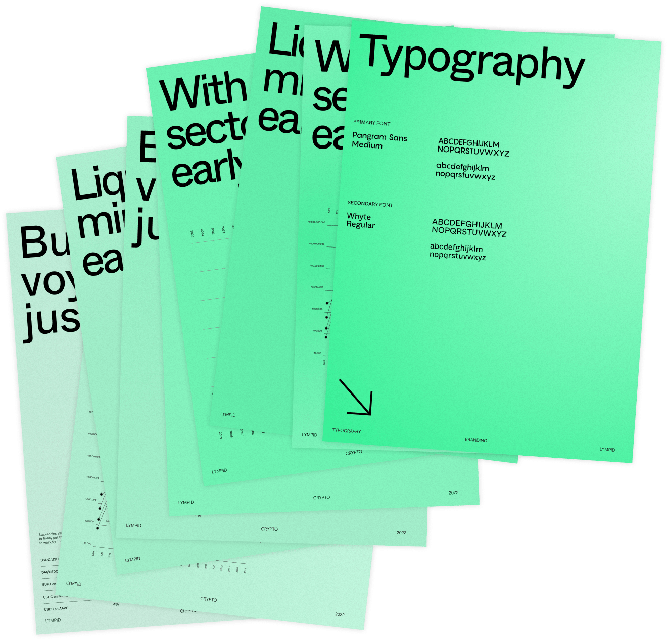
The main goal was to bring to the brand the idea of transparency and easy-to-use. To do that we took a multidisciplinary approach conceptualizing all elements of branding. For that, we use a strong color pallet that refers to the water element.
The main goal was to bring to the brand the idea of transparency and easy-to-use. To do that we took a multidisciplinary approach conceptualizing all elements of branding. For that, we use a strong color pallet that refers to the water element.
The main goal was to bring to the brand the idea of transparency and easy-to-use. To do that we took a multidisciplinary approach conceptualizing all elements of branding. For that, we use a strong color pallet that refers to the water element.
The main goal was to bring to the brand the idea of transparency and easy-to-use. To do that we took a multidisciplinary approach conceptualizing all elements of branding. For that, we use a strong color pallet that refers to the water element.
The main goal was to bring to the brand the idea of transparency and easy-to-use. To do that we took a multidisciplinary approach conceptualizing all elements of branding. For that, we use a strong color pallet that refers to the water element.
We combined geometric fonts to give the brand a minimalist and geometric look, bringing the idea of transparency and ease of use.
We combined geometric fonts to give the brand a minimalist and geometric look, bringing the idea of transparency and ease of use.
We combined geometric fonts to give the brand a minimalist and geometric look, bringing the idea of transparency and ease of use.
We combined geometric fonts to give the brand a minimalist and geometric look, bringing the idea of transparency and ease of use.
We combined geometric fonts to give the brand a minimalist and geometric look, bringing the idea of transparency and ease of use.
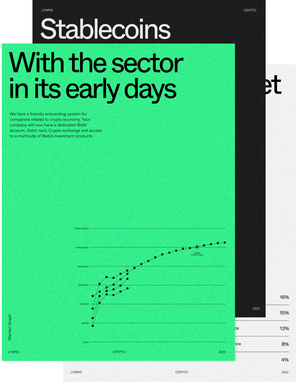
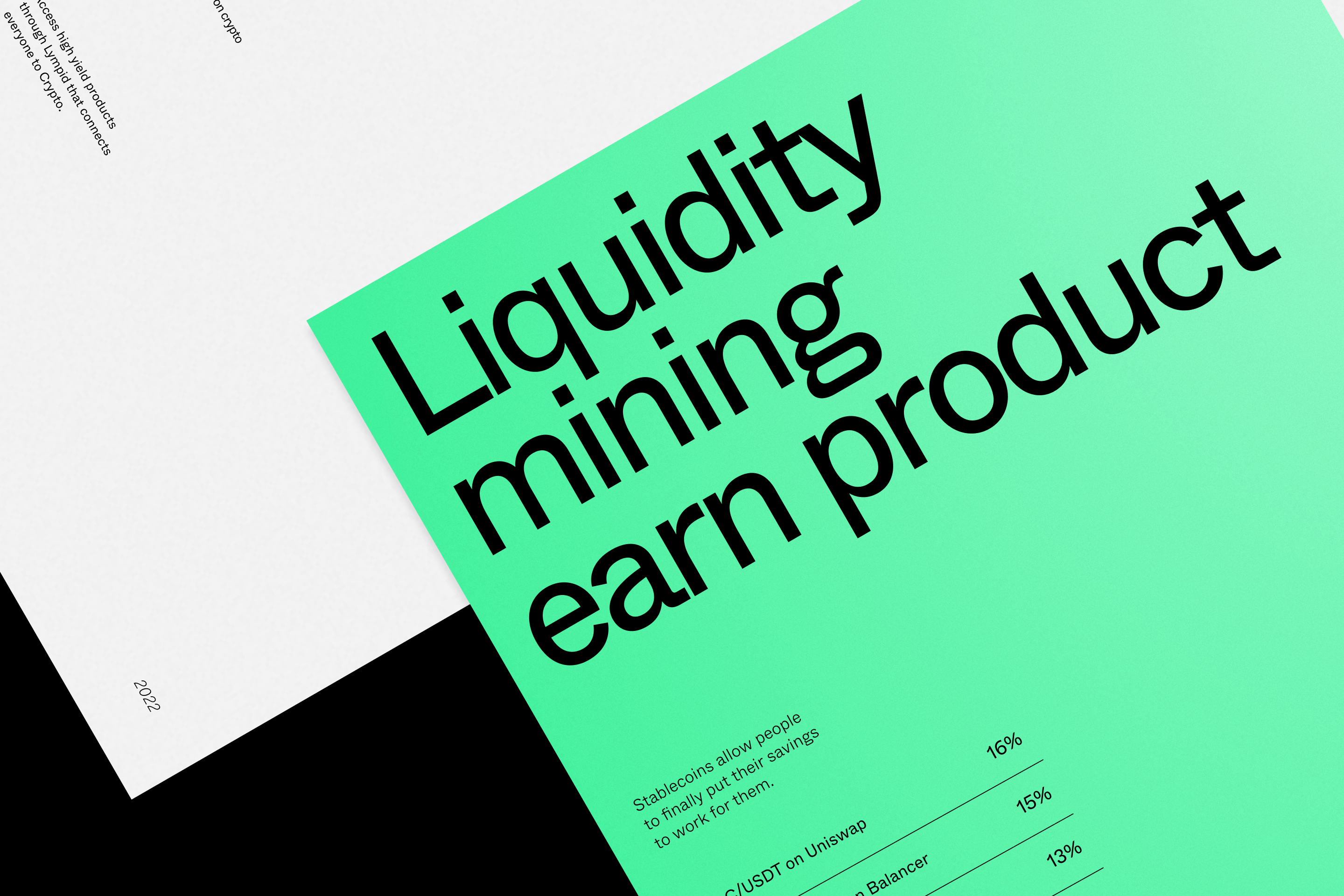
The website of the project was developed by us. Direct but smooth, bringing the brand closer to the human-centric world of consumer brands.
The website of the project was developed by us. Direct but smooth, bringing the brand closer to the human-centric world of consumer brands.
The website of the project was developed by us. Direct but smooth, bringing the brand closer to the human-centric world of consumer brands.
The website of the project was developed by us. Direct but smooth, bringing the brand closer to the human-centric world of consumer brands.
The website of the project was developed by us. Direct but smooth, bringing the brand closer to the human-centric world of consumer brands.


Other Works

Go ParityUx Ui | Webdesign

Dhrama - CeramicsBranding + Webdesign

Mima HousingBranding + Webdesign

EDPVisual Design + Development

Origami de RabosVisual Design + Branding

Nonna Pasta FrescaVisual Design + Branding

Portugal ActiveBranding + Webdesign
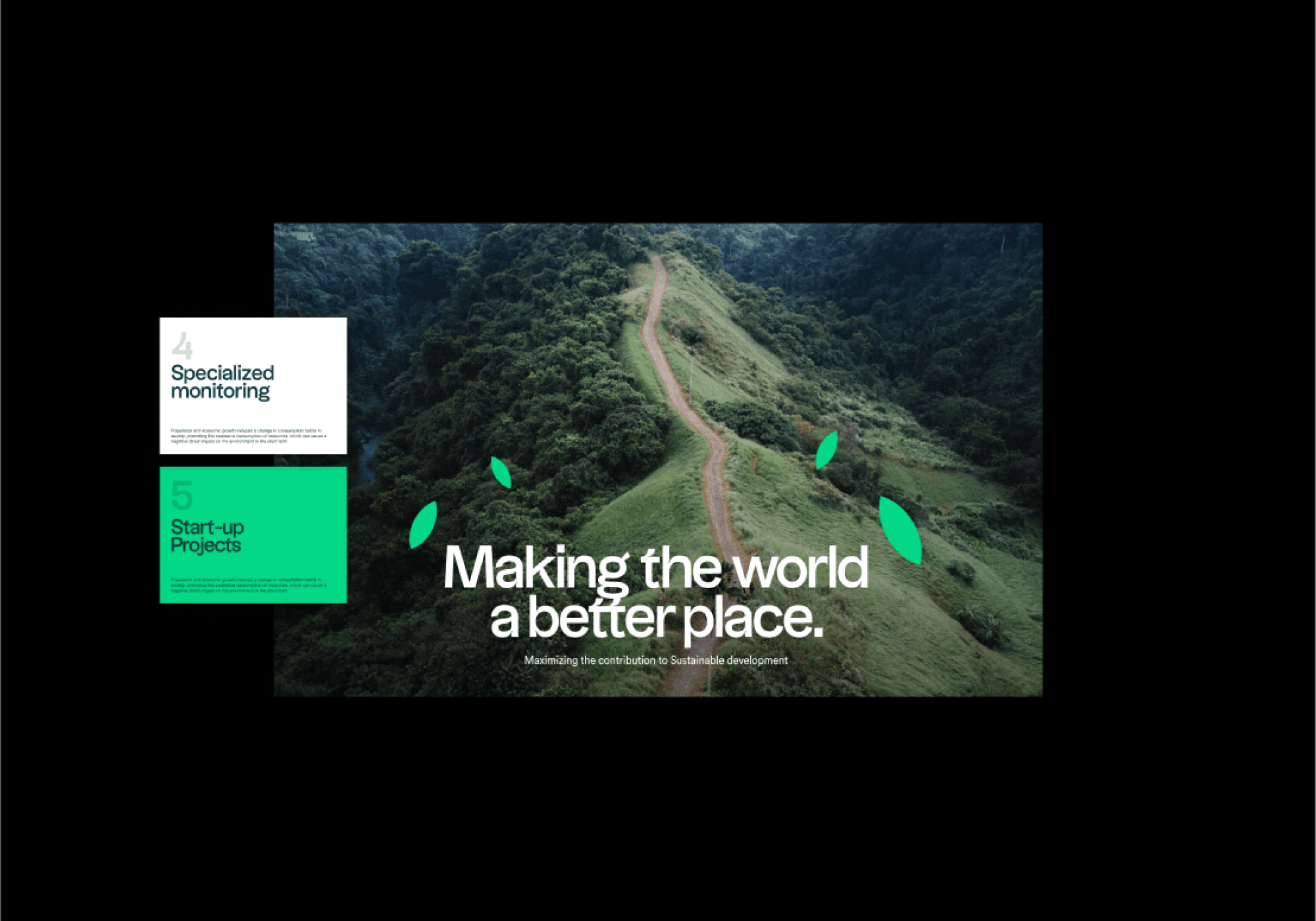
LinkgreenBranding + Webdesign
