Mima Housing

Project type: Branding + Webdesign | www.mimahousing.com
Year: 2021
arrow_down

MIMA is a multidisciplinary architecture firm that focuses simultaneously on the formulation of architectural concepts and in their conversion to reality, under the form of simple and accessible products. MIMA intends to be more than an architecture office, and rather epitomize a brand new philosophy of simplification and seduction that will gradually apply to the most varied scales of architecture.


We develop the UI/UX, website, visual identity and look and feel of the brand.

Group-1362-cp

In this project we had a multidisciplinary approach that started with the brand design and ended with the launch of the new Mima Housing website.

Under the concept of the modular grid used by the architects of mima in the projects, we concretized the monogram, which is combined with a grotesque font.
The look and feel of the brand was built using the combination of a grotesque font and a serif. The brand's palette revolves around shades of white and gray.


mima_housing
mima housing

Developing a new identity presented an opportunity to go bold and surprise the industry.

Direct but smooth, bringing the brand closer to the human-centric world of consumer brands. The earthy colour palette and classy typeface come together to give the brand a lively and dynamic, yet tactile feel.

Developing a new identity presented an opportunity to go bold and surprise the industry.

Direct but smooth, bringing the brand closer to the human-centric world of consumer brands. The earthy colour palette and classy typeface come together to give the brand a lively and dynamic, yet tactile feel.

Developing a new identity presented an opportunity to go bold and surprise the industry.

Direct but smooth, bringing the brand closer to the human-centric world of consumer brands. The earthy colour palette and classy typeface come together to give the brand a lively and dynamic, yet tactile feel.

Developing a new identity presented an opportunity to go bold and surprise the industry.

Direct but smooth, bringing the brand closer to the human-centric world of consumer brands. The earthy colour palette and classy typeface come together to give the brand a lively and dynamic, yet tactile feel.

Phone
open-magazine-mockup-isometric-v3-cp

Other Works

Go ParityUx Ui | Webdesign

Dhrama - CeramicsBranding + Webdesign

EDPVisual Design + Development

Origami de RabosVisual Design + Branding

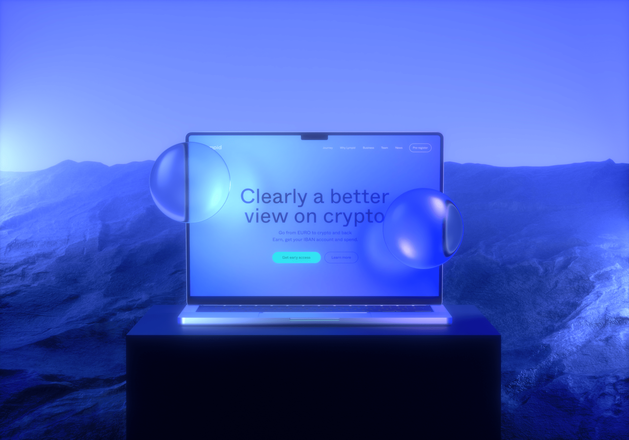
LympidVisual Design + Branding

Portugal ActiveBranding + Webdesign

LinkgreenBranding + Webdesign

HEY LET'S TALK!

HEY LET'S TALK!

HEY LET'S TALK!

HEY LET'S TALK!

INFO@STUDIO-RANA.COM

INFO@STUDIO-RANA.COM

INFO@STUDIO-RANA.COM

INFO@STUDIO-RANA.COM

_sticker

ADDRESS

PORTO

Caminho da Estrada Velha 190
4900-059 Afife
Viana do Castelo

Rua Instituto de Cegos de São Manuel,
231 4050-308 Porto

Rua Instituto de Cegos de São Manuel,
231 4050-308 Porto

APPLYING FOR INTERNSHIPS

APPLYING FOR INTERNSHIPS

Interested in working with us?
Come by the studio and get to know our work environment.
Please email us a link to your portfolio at
jobs@studio-rana.com.

© 2023 All rights reserved Studio Rana Unip. Lda.